Typography is an art and skill which is enjoying a renaissance in interest within the design community. Along with use of space and use of colour, typography is one of the most important facets of good design, and the expert use of tools to manipulate typographical elements cannot be emphasized enough. In this in-depth post, we will be going through some of the tools, at both beginner and advanced levels, available to use when working with type within that unappreciated program, Adobe InDesign.
The Character Palette
At first glance, the Character palette is pretty straightforward. You can select a typeface, its style, the leading (the space between lines), tracking (the overall spacing between characters) and kerning (the space between an individual set of characters) as well as some text distortion options. While simple in function and layout, control over a wide variety of typographical options exist within this palette, particularly with regards to tracking, kerning and leading.
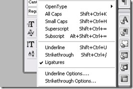
The hidden side of the Character palette can be discovered through the drop-down context menu. In this menu, a wealth of other options is available: overall OpenType settings for contextual replacements and other OpenType features; type styles, whether all caps, small caps, strike-through, etc; as well as further options for both underline and strike-through. The OpenType settings allow you great control over selecting which OpenType features you want to enable for this paragraph. The side benefit to both the strike-through and underline options that is you can use these to highlight live text within the text box itself, as opposed to having to create a separate rectangular object to draw attention to a particular word or phrase. When digging a little deeper, we discover that the Character palette has much more to offer than just simply allowing us to choose a typeface and size.
The Paragraph Palette
The Paragraph palette, meanwhile, allows for over-arching control suited to creating the shape of the paragraph itself. Justification, alignment & hyphenation options abound, and these allow for a wide degree of control over the typographical color of a paragraph or page, providing macro-level adjustments which affect entire bodies of text.
Where the fun begins, much like with the Character Palette, is with the drop-down context menu. The first two options are for Single-Line or Paragraph Composers. Single-Line optimizes the hyphenation and justification options for each individual line, whereas Paragraph optimizes lines based on the needs of the entire paragraph. For example, Paragraph will adjust the spacing and hyphenation of an earlier line to make room if a later line in the paragraph contains a troublesome word, whereas Single-Line would simply adjust the paragraph on a line by line basis.
Some other options within the context menu for the Paragraph palette include links to the menus for Hyphenation and Justification (more on that shortly), an option to balance the ragged lines of a non-justified paragraph, options for bullets & numbering for lists and other larger-scale options. Once again, the depth of InDesign’s typographical control really shines through within the context menu of a particular palette.
The Glyph Palette
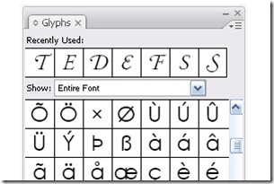
We’re only going to take a quick look at the Glyph palette, as it’s not as deep as the other two, but it is still quite useful. Basically, the Glyph palette contains every character for the font you’re working with. The principle use for the Glyph palette is for the manual substitution of a selected character or set of characters within your document for ones you choose from the palette itself. Some uses for this could include subbing in old style numerals to replace lining, or manually inserting ligatures. The other main use for the Glyph palette is the creation of Glyph sets.
A Glyph set is a collection of glyphs which you might use on a regular basis, regardless of which typeface or style it is. Let’s say you’re a fan of a particular set of old-style figures and use it across multiple documents, regardless of any other design factors. Creating a glyph set containing those old-style figures allows you to quickly and easily find them and insert them into a document without having to go digging through each font for the right options.
Hyphenation
The control we have over hyphenation with InDesign is unreal and, particularly when combined with the justification controls, can result in some really slick paragraphs which let the text breathe and helps captivate the reader’s interest. We can reach the hyphenation controls through the context menu in the Paragraph palette, which gives us a pop-up dialogue box containing the hyphenation controls. While what each option does is self-explanatory, there are a couple of guidelines which can help your text sing.
Proper hyphenation requires some care and supervision, but can be generally controlled through the hyphenation options. In general, we should leave at least two characters on the start line, and have at least three on the finishing line; with InDesign, we’d set that as hyphenating after the first 2 letters but before the last 3. We should also avoid more than three consecutive hyphenated lines, to prevent a distracting rag. Any word shorter than 5 is too short to require hyphenation (though you can set this as low as 3), and in general, the last word should not be hyphenated in order to prevent any widows. InDesign can take care of all these more automatic hyphenating tasks, leaving the subjective ones (such as avoiding hyphenation where It awkwardly int-terupts a word, etc) to us to remedy.
Justification
Like hyphenation, we reach the justification panel through Paragraph palette’s context menu. The options for justification are self-explanatory, but the real benefits don’t kick in until we begin to explore a bit. Word spacing will adjust the spacing of words, and generally a range of 80%-100%-120% will give us a decently spaced paragraph without too much distraction. Letter spacing, meanwhile, can afford some flexibility as well; in general, a range of -5%-0-5% is ideal. Glyph scaling affords another means to “tweak” the words to make a paragraph optimally justified, and generally around 95%-100%-105% will allow the glyphs enough room to adjust without being noticeably larger or smaller.
There’s also options to adjust the auto leading percentage as well as single-word justify; 120% is InDesign’s default for leading, and typically single words should be aligned left. Through all these different adjustments, ensure that the drop-down menu for Composer is set to Paragraph in order to set the engine to adjust for the paragraph as a whole, not each individual line.
These are general guidelines which I’ve found make a decent, workable range. Each paragraph might call for different settings, but like all things design, smaller changes are preferable to sweeping ones. When combining the features of hyphenation with justification, some really beautiful paragraphs are possible which stretch from margin to margin, without rivers, orphans and widows or any other distractions.
That’s a Wrap
InDesign is a powerful program which, unfortunately, doesn’t enjoy the same widespread appeal in the tutorial & blogging world as Photoshop or other programs in the Creative Suite. However, the wide range of options and tools available to you makes it the ideal program for working with typography. I hope you found this post useful, as it barely scratches the surface for what InDesign is capable of with type.


19 comments:
Its quiet a nice & informative post talking about typography in detail. You have covered all areas of interest. As a Joomla Website Designer I will love to try this innovative thing in my future designs.
Nice design in typography....
Thank you for sharing it....Content Management System
Very long yet very informative read. Typography is a really interesting topic. At least for me.
magnets
Excellent design and good information on Typography Design in InDesign. You really have a great points here. You guys are always talented. Thanks for sharing. joomla development company
Excellent designs and useful information. Great way of explanation because you have described everything very clearly in this post.
Domain registration india
It was just informative news sharing and it's really helpful for everyone. Thanks for that.
- region free dvd
Nice tutorial and good stuff. I like this design very much. Typography is a new and different information for me. Thanks for sharing.
register web domain
Adobe is the expert in Design Software industry and I am quite sure what InDesign is capable of. Thanks for this excellent information.
seo services
really this one is so good topic. i like this one.and here shown the all themes and visual explain and information also very good. i got more idea & information from this topic.this one thanks to share with us...
seo usa
Typography is interesting design community..and this is good topic for typography..i learn it's and enjoy with us..
This kind of information is very limited on internet. Nice to find the post related to my searching criteria. Your updated and informative post will be appreciated by blog loving people.
logo design perth
Just wanted to drop a comment and say I am new to your blog and really like what I am reading. Thanks for the great content. Look forward to coming back for more. website hosting india
web hosting
I just take a peek and I suddenly discovered our impressive post. I enjoyed reading it. I find it interesting. Thank you for sharing.
web design Philippines
This is one of the more memorable posts I have read on this topic - in large part due to the writing style displayed here. Inasmuch as I appreciate reading informative posts, I appreciate - even more - content that is delivered in an entertaining and captivating style ... which this is! Cell Phone Lookup
it was just informative news and thanks for sharing such a useful information.
You have described it very well. Now a day, I feel that, No need to go to out because Internet showing me a more information to read. Today I have got a new information from your blog... Domain India
Great brilliant informtion is shared and explained clearly about its topic here.
web designing company
Great talk about typography. InDesign is such a great tool for web designing. But I believe I still have much to learn about it.
-------------------------------------
wall decals | wall stickers | vinyl wall art | wall quotes | nursery wall decals
Again, thanks this is great information! - Gutter Guards
Gutter Covers
Gutter Protection
Post a Comment